

A Perfect Setup for a Stock Market Correction
Claus Vogt from Money and Markets at 10/28/09
Since there's no holy grail to analyze financial markets, the best approach is an eclectic one. So I incorporate as many tools as possible in my analysis, including: Fundamental valuations, macroeconomic models, monetary and fiscal policies, interest rate developments, sentiment and momentum indicators, and chart analysis.
Major market turning points are usually characterized by many of these tools. That was clearly the case in 2007 when everything fell neatly into place to call the end of a bull market that had started in 2003.
To a somewhat lesser degree that has also been the case starting this June, signaling a medium-term up trend. And that's why I still expect it to continue during the coming months.
But even the strongest bull markets aren't one-way affairs. They're often interrupted by short-term corrections typically lasting six to eight weeks with prices falling 10 percent to 15 percent. And right now I think such a correction has just begun.
Here's why ...
All Major U.S. Stock Market Indexes Are Bumping Against Important ResistanceThese technical resistance points are important enough to warrant the beginning of the first large correction since this medium-term rally began in March 2009.
Let's start with the S&P 500 ...
As you can see on my first chart, this index hit the resistance line going back all the way to its October 2007 high.
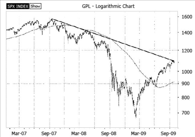
This trend line is very significant, because it defines the bear market of 2007 to 2009 when the S&P 500 lost 57 percent. And I think it's highly unlikely that this resistance line will be broken through on the very first try.
It's much more likely that the market — which is already tired after the huge runup of the past months — will have to retreat from here to gather enough strength to overcome this technical hurdle.
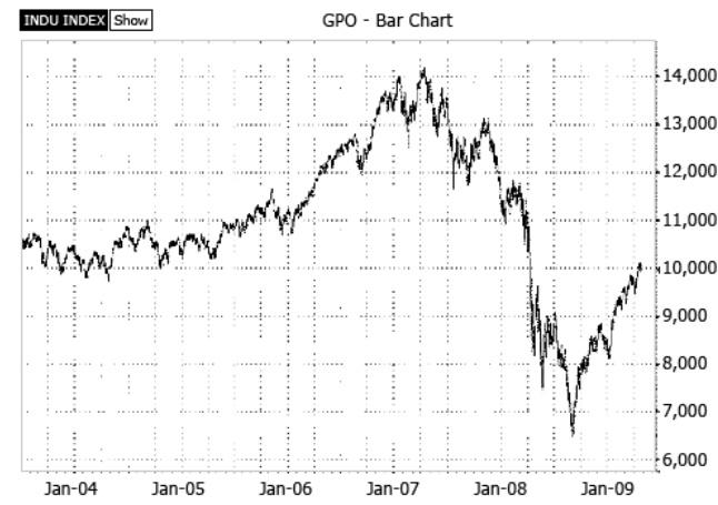
Next, have a look at chart below of the Dow Jones Industrial Average ...
On a first glance you may think there isn't any resistance below 11,000, especially if you only look back two or three years. But if you go back a bit further, to 2005 and 2004, you can see the massive resistance around the 10,000 area. This marks the lower boundary of a very massive trading range.
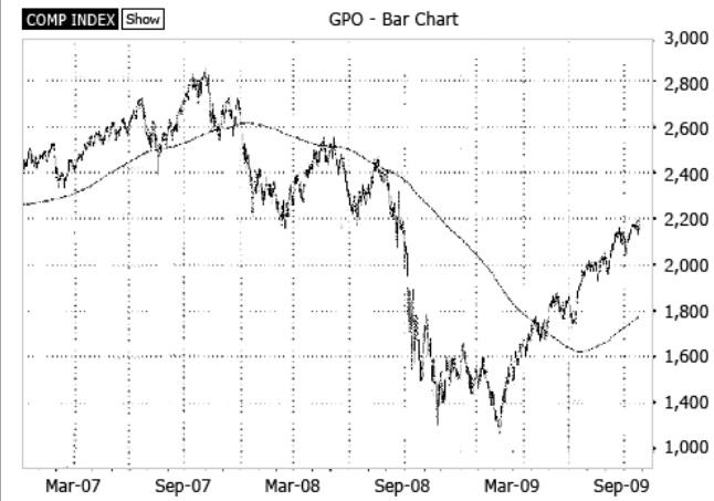
Next, the Nasdaq Composite ...
The Nasdaq has already reached the equivalent of 1,200 in the S&P or 11,000 in the Dow ... the short-term bottom of 2008, before all hell broke loose. This is a very obvious resistance point.
Now, take a look at the Dow Jones Transportation Average ...
The Transports are showing a huge topping formation that began to form at the end of 2005 and lasted until fall 2008. When it broke to the down side, a crash wave ensued.
As you can see on the chart below, this index is now back to the lower boundary of that huge formation, a classic resistance area that's not easily broken.

Finally, let's examine the Dow Jones Utility Average ...
The Utilities have been relatively weak since their March low. But they, too, are bumping against resistance now. This index formed a very nice topping formation from 2006 to 2008, thus a bit shorter than its cousin, the Transportation Average. But the result when it was broken was the same: A market crash in 2008.
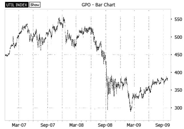
Even though this index has risen much less than the others, it has still entered a massive resistance area stemming from its trading range last fall.
Five Different Resistance PatternsSo here you have it. Five indexes showing very different chart patterns. But they're all hitting major technical resistance areas at the same time! This makes for a very strong picture of a market that'll have difficulties rising any further without a correction first.
In Fact, Other Technical Indicators Are Equally Weak ...
The whole technical picture has become very fragile during the past weeks:
Volumes have been dismal: Declining when the market rose and rising when it retreated. Momentum indicators show multiple negative divergences: They did not rise to new relative highs during the past three up-waves in the market. Market breadth shows a similar picture: The ratio of advancing to declining stocks was lower at each of the past up-moves in the market. Put-call-ratios were back to frothy levels: The equity only put-call-ratio fell to 0.52 a few days ago, a level often associated with short-term exhaustion.All in all I get the impression that the first big correction of this medium-term up trend is already underway. I expect it to last until late November and bring prices back 10 percent to 15 percent.
However, I don't expect this correction to herald a major trend change. Hence, I suggest you consider using it as a buying opportunity.